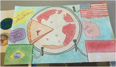
Q1: This is my pie portraying worldwide deforestation
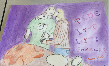
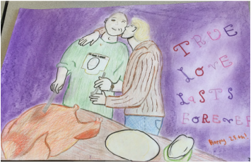 This piece was for my parents for their anniversary 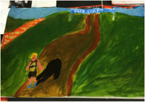 Q2: Fun piece, inspired by Andrew Wyeth's painting seen at the Art Museum 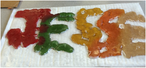 My melting gummy bear piece using nontraditional materials portrays change 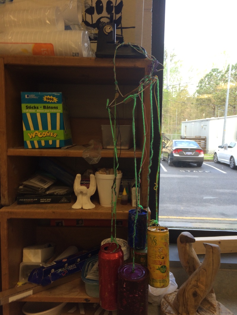 nontraditional materials windchime using tin and soda cans and wire. | Question One: What media did you choose for this artwork and why did you pick it? What did you intend to communicate in this artwork? How does the media you selected help communicate the message you intended? Is the piece successful? Why or why not? My first piece: the "pie of deforestation" was completed using mostly chalk pastels layered on top of colored pencil and sharpie outlines. I was originally going to use colored pencils because I am comfortable using them and they are good for accomplishing detail. Since this was our "worldwide issue" project, it was easy to portray communication of a problem in the world. For me, this communicates literal idea; the problem of deforestation worldwide and how certain countries are using up all the resources. This piece did accomplish its goal of portraying its issue in the way that I hoped; some pieces however, change throughout the time it is made (such as my pie from sculpture). My second piece was a piece made for my parents' anniversary, titled "True Love Lasts Forever". This piece was done with a combination of colored pencils on the figures and chalk pastels on the background. I chose chalk pastels (on both pieces) because they cover a large area well and fairly quickly. The colored pencils on this piece allowed for great detailing and texture, if I do say so myself. This picture is trying to communicate the figurative idea of love, which can be shown through art in many ways. I tried to portray love by the warm colors and actual action of them kissing. (Awww). I think while less obvious, this piece too, displays communication of love. Question Two: What projects or units did you enjoy? What would you add or take away to make the class a better learning experience? I had fun with all these projects, but I liked the units' concepts better than how my most of my projects turned out. I liked the change project the most because I got to use different brands of gummy bears to melt and create my name and a rainbow. These I think turned out well and continue to change and warp as the temperature around them changes. I also had fun with the nontraditional materials unit because we had to think past our normal materials and be more creative. I had fun collecting cans of all kinds and putting them together to create the wind chime (which is still in use in our backyard, f.y.i.). The last project we did that I had a lot of fun with was the piece based on a piece we saw after going to the art museum. There were many pieces I saw that I enjoyed at the museum, but went with the Andrew Wyeth painting of the boy running down the hill. This piece was my inspiration and basis to create my identity piece, seen above. I used his piece as a reference but it did not turn out as how I planned. |


 RSS Feed
