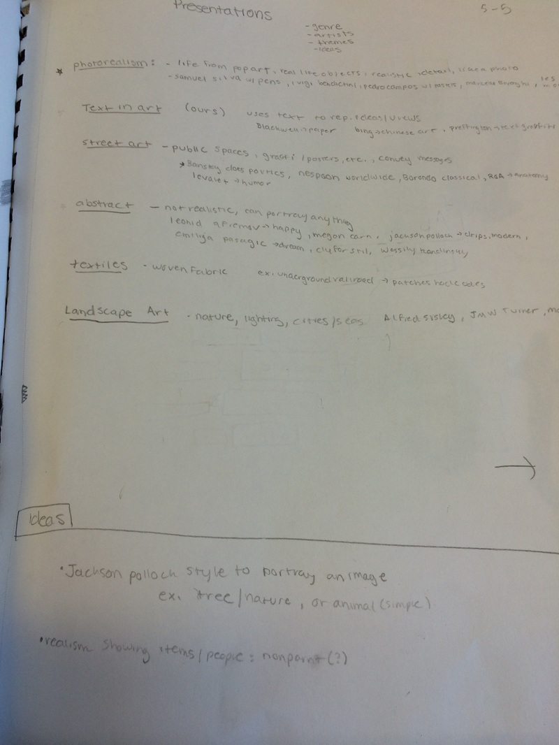
 This is my presentation notes, the basis of choosing my topics. I decided to go with photo realism (which turned into portraiture) and text art. |  These are my mind maps for my ideas, deciding to go with a picture of my parents for their 25th anniversary and Harry Potter text art since I like the book series. | 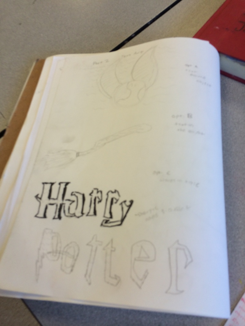 These are basic sketches for my Harry Potter text art. Practicing which ways to lay out the words and objects to use. | Part One: Planning Pinterest Links: For Text Art: https://www.pinterest.com/lightningred123/text-in-art/ For Photorealsim: https://www.pinterest.com/lightningred123/photorealism/ |
 My final piece; bold title with a 3-D look with real excerpts surrounding the title from book one. | 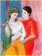 Picasso's "Lovers". Similar style and form to mine, but not very realistic. | 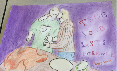 My piece that is based off a picture of my parents last Thanksgiving. My Dads compares it to Picasso's "Lovers" piece (this was unintentional.. |
Reflection:
Part One: "True Love Lasts Forever"
I worked hard on this piece, originally planning it to be photorealism (making the art look almost exactly like the reference picture). I began by "tracing" the picture to a piece of paper from the projector, but could not get details. That is when I ran into trouble, and where the piece started to become portraiture, not exactly photorealism (the detailing and features were not 100% proportional, but it is still evident what is trying to be accomplished by the art). Over all, I like the background, title,and texture created by the colored pencils; but could improve on proportion to figures. Fun fact: this was a gift to my parents for their anniversary and when I gave it to them, my dad compared it to Picasso. This is interesting because on one of my parents' first dates, my dad bought my mom a copy of the above piece as a gift!
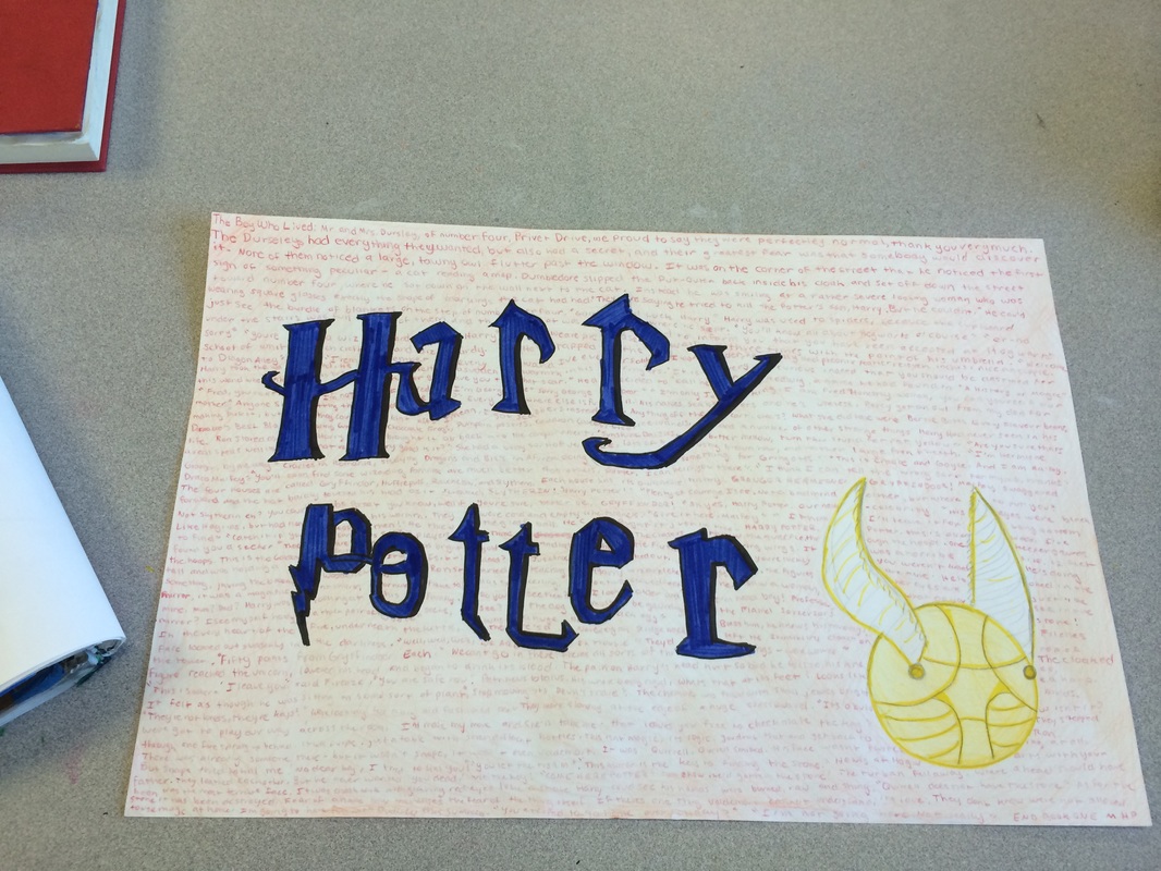
Part Two: "The Boy Who Lived"
This piece took a lot of patience and logic, believe it or not! while it did not take too long to create, I wanted to summarize the important parts of "The Sorcerer's Stone" by using actual text, but it proved hard to pick the "correct" events to use. The strong part of this piece if definitely the title "Harry Potter", using a 3-D effect and detailing to make it look like the titles on the books. I do like how the background words turned out, but am more pleased that I decided to add a light coloring (in orange over the red words, since orange goes with blue and red) to make it look more finished. If I were to redo this project, I would have made the words smaller and closer together to make it look more interesting and to fit more into the piece. Overall, while this may not be the most complicated piece, besides the pie I made in sculpture, this is one of the pieces I am most proud of.
Part One: "True Love Lasts Forever"
I worked hard on this piece, originally planning it to be photorealism (making the art look almost exactly like the reference picture). I began by "tracing" the picture to a piece of paper from the projector, but could not get details. That is when I ran into trouble, and where the piece started to become portraiture, not exactly photorealism (the detailing and features were not 100% proportional, but it is still evident what is trying to be accomplished by the art). Over all, I like the background, title,and texture created by the colored pencils; but could improve on proportion to figures. Fun fact: this was a gift to my parents for their anniversary and when I gave it to them, my dad compared it to Picasso. This is interesting because on one of my parents' first dates, my dad bought my mom a copy of the above piece as a gift!
Part Two: "The Boy Who Lived"
This piece took a lot of patience and logic, believe it or not! while it did not take too long to create, I wanted to summarize the important parts of "The Sorcerer's Stone" by using actual text, but it proved hard to pick the "correct" events to use. The strong part of this piece if definitely the title "Harry Potter", using a 3-D effect and detailing to make it look like the titles on the books. I do like how the background words turned out, but am more pleased that I decided to add a light coloring (in orange over the red words, since orange goes with blue and red) to make it look more finished. If I were to redo this project, I would have made the words smaller and closer together to make it look more interesting and to fit more into the piece. Overall, while this may not be the most complicated piece, besides the pie I made in sculpture, this is one of the pieces I am most proud of.

 RSS Feed
